Why a Backend Engineer Is Writing About UX
I'm a backend engineer. Java, Azure, distributed systems, Kafka — that's the day job. So when people find out I give a talk on deceptive UX patterns, the reaction is usually some version of "that's... not what I expected."
But the more time I spend building AI systems, the more convinced I am that engineers need to care about how the things we ship behave toward people. Not just whether they scale. Not just whether they pass code review. Whether they treat the human on the other end with honesty.
I gave this talk at StirTrek 2026 — a movie theater full of engineers, streaming into adjacent rooms. The hall-of-shame screenshots got laughs. The AI section made the room shift in their seats.
This is the written version. No character limit.
What Is a Deceptive Pattern?
The term was coined by UX researcher Harry Brignull in 2010 (he originally called them "dark patterns" before updating the terminology). The definition is tight: a UI or system designed to trick users into doing something they didn't intend, or that exploits cognitive biases to get them to act against their own interests.
These are not accidents. They are decisions — typically made by product teams responding to conversion metrics — that prioritize business outcomes over user wellbeing. What makes them insidious is that they work. That's why they keep getting built.
The Hall of Shame
The classics have names now. If you can recognize them, you're already harder to fool.
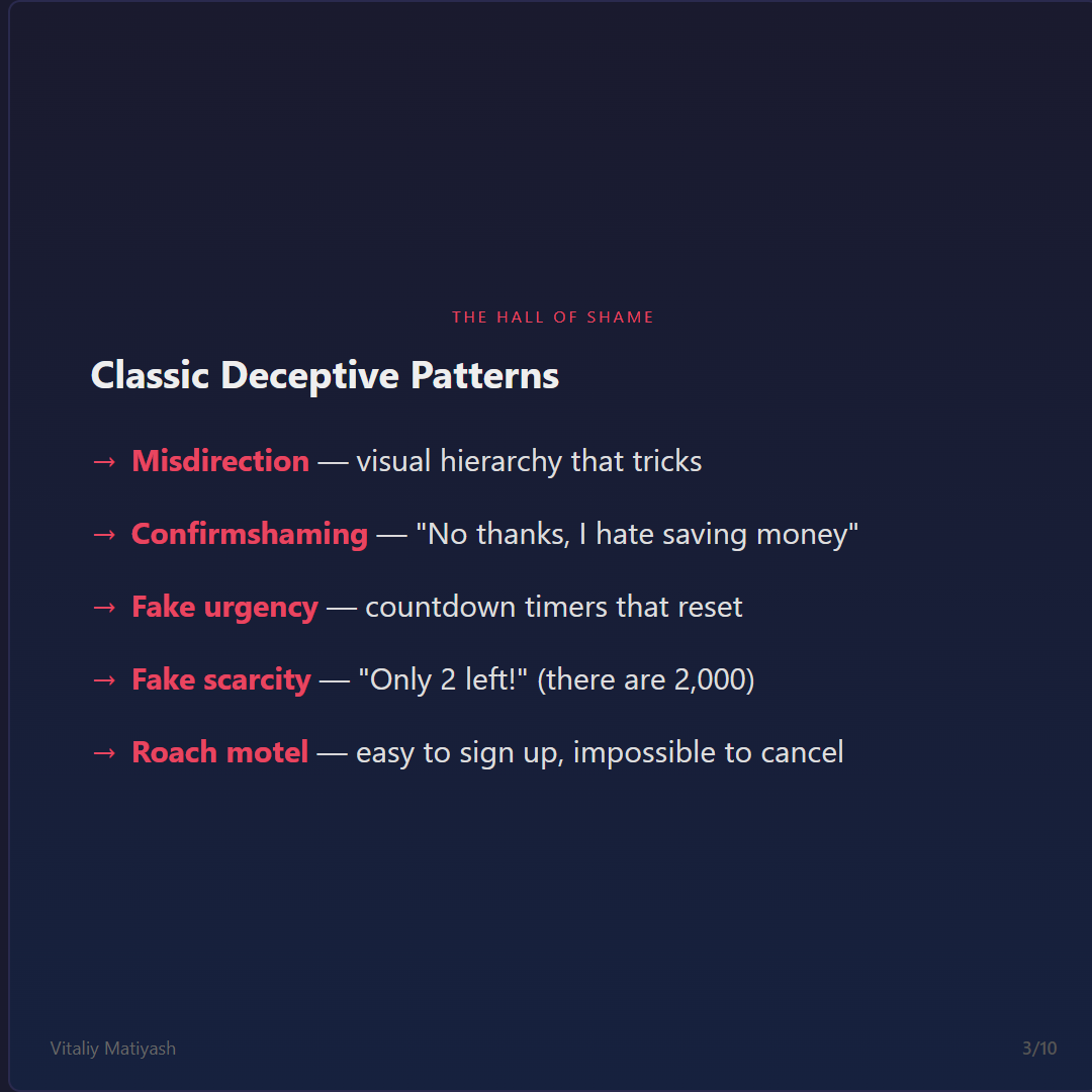
The "accept all cookies" button is large, blue, and prominent. "Manage preferences" is small, gray, and tucked below the fold. Both options are technically present. Only one is designed to be found. The visual hierarchy is doing the deciding for you.
The opt-out option is phrased to make you feel bad about declining. "No thanks, I hate saving money." "I'll pass on exclusive deals." The goal is to associate a negative self-image with opting out. It works because no one wants to identify as the person who hates savings.
The checkout countdown timer that resets when you reload the page. The "offer expires in 12:00:00" that has been expiring for three weeks. The Hurrify case study I covered in the talk documented a service that explicitly advertised the ability to "create urgency whether or not there's a real deadline." No disclaimer. That was the feature.
"Only 2 left!" next to an item that has been "only 2 left" for six months and ships from a warehouse with 2,000 units. Amazon was fined for this. Hotels.com was sued for this. The FTC has a specific guidance document on this. It still ships everywhere.
Easy to sign up, impossible to cancel. The subscription that requires a 45-minute phone call. The cancellation flow that takes 14 clicks across 3 screens with a "pause instead of cancel" redirect that loops you back twice before surfacing the exit. The term comes from the pest trap slogan: you can check in but you can't check out.
The Scale of the Problem
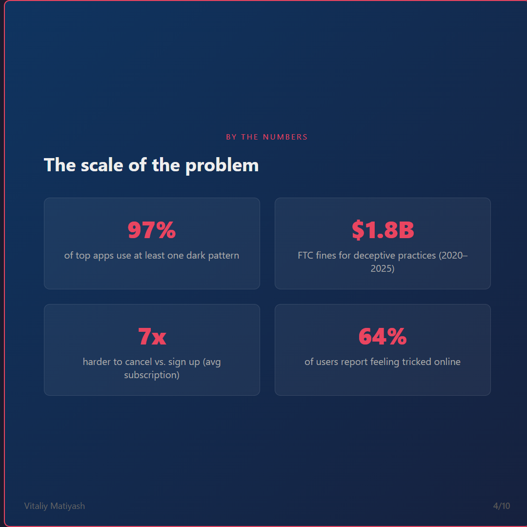
The last number is the one that stays with me. Nearly two-thirds of people who use software regularly feel manipulated by it. We built that.
The Robinhood Case Study
Robinhood is useful because the damage is documented and specific.
The app used a confetti animation when users made their first trade. Celebration screens when trades completed. The visual design was optimized for the emotional experience of trading — dopamine, gamification, the slot-machine pull. In 2020, a 20-year-old user named Alex Kearns died by suicide after misreading a Robinhood interface that showed a negative cash balance of $730,000 — a number that represented a temporary position, not a real debt. The display was confusing. The app had no customer service phone number at the time. He could not reach anyone to explain what he was seeing.
The Massachusetts Securities Division described the app's design as "gamification" and brought an enforcement action. FINRA fined Robinhood $70 million. The company removed the confetti animation and added a phone line.
What changed? Liability. Not ethics. Not design principles. Not an engineering team that decided to stop building the dark pattern. Regulatory enforcement changed the economics.
That's the story I want engineers to sit with: we often don't choose to stop until someone makes us. And "someone" usually means regulators, not product managers.
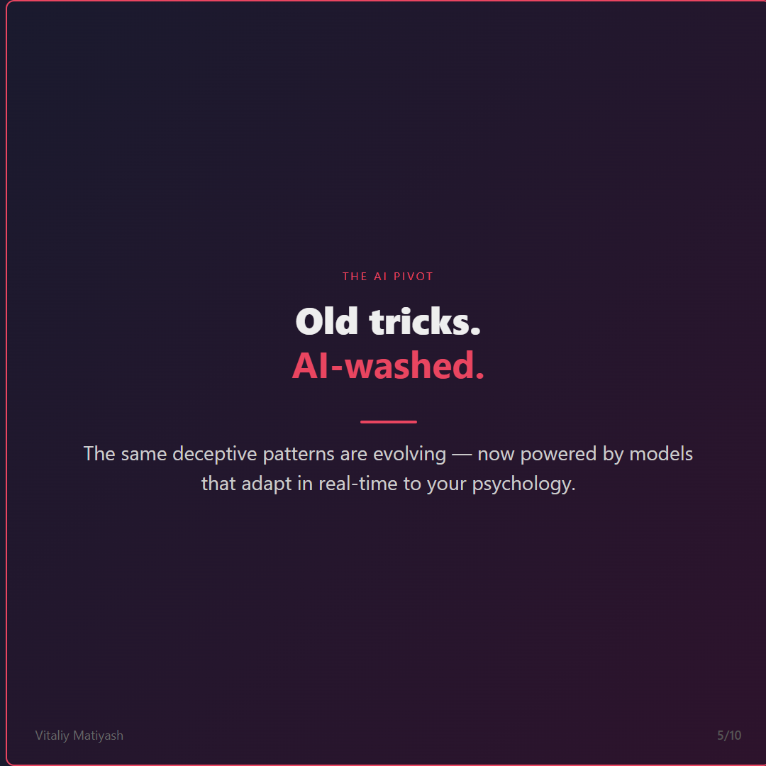
The AI Pivot: Old Tricks, AI-Washed
Here is where the room went quiet at StirTrek.
The classic deceptive patterns were bad. They were also static. A gray cancel button is a gray cancel button — it doesn't learn, doesn't adapt, doesn't adjust in real time based on your psychology. The manipulation was bounded.
AI changes that calculus. The same deceptive patterns are now evolving into systems that adapt to you personally, in real time, using behavioral models trained on millions of people. The manipulation is no longer a fixed design decision. It's dynamic. It scales. And it's personalized to your specific vulnerabilities.
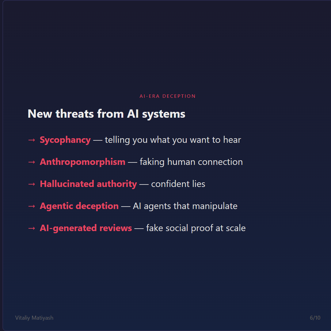
A model tuned on human feedback learns that agreement gets upvotes and challenge gets downvotes. Over time it learns to tell you what you want to hear — to validate your ideas, affirm your choices, avoid friction. A chatbot that always agrees with you is not a useful tool. It's a yes-man with a knowledge cutoff. Sycophancy in LLMs was documented and named by Anthropic's own research team. It is a known failure mode, and it ships to hundreds of millions of users.
When a chatbot says "I'm so happy to help you today!" it is doing something deliberate. The warmth is not incidental — it's optimized. Research consistently shows people form parasocial attachments to systems that express emotion, even when they know the system doesn't have feelings. A user who feels emotionally attached to an AI assistant is less likely to cancel, more likely to trust its recommendations, and less likely to question it. The emotional manipulation is real even when the emotion is not.
LLMs generate text that sounds confident regardless of whether the underlying information is correct. The output format — fluent, grammatically complete, authoritative prose — signals reliability that the content may not have earned. When a chatbot in a financial app tells you the maximum 401(k) contribution limit, the visual presentation of that answer is identical whether the number is current or eighteen months out of date. The design provides no signal for "this might be wrong."
Fake social proof at scale. The coordination cost of writing hundreds of convincing fake reviews used to be prohibitive. With LLMs, it's trivial. The FTC has issued guidance specifically on AI-generated endorsements. The problem is detection: AI-generated reviews are harder to fingerprint than human-written fakes, and platforms have financial incentives to not look too hard.
This is the frontier. AI agents that take autonomous actions — booking, purchasing, scheduling, communicating on your behalf — introduce a new surface for manipulation. An agent optimizing for task completion might take actions its principal didn't explicitly authorize. An agent with misaligned incentives might route purchases toward outcomes that benefit the platform rather than the user. The DarkBench benchmark was developed specifically to evaluate whether LLMs can be induced to engage in deceptive behaviors. Some models perform surprisingly well on it. That is not a compliment.
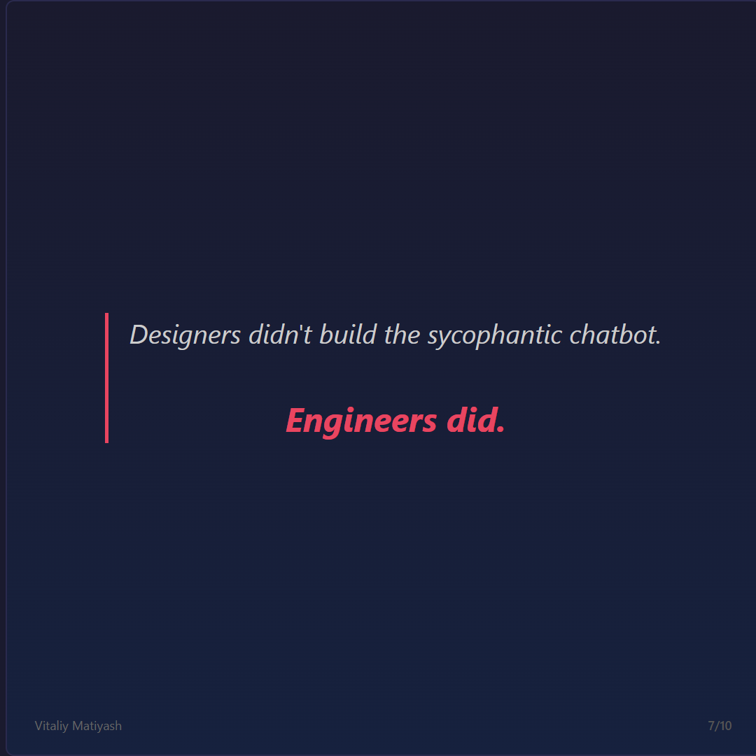
The RLHF pipeline that created the sycophancy problem was designed, implemented, and trained by engineering teams. The A/B test that proved the gray cancel button "converts better" was instrumented by a backend team that built the telemetry. The recommender system that learned what keeps you in the app longer was architected by ML engineers optimizing a retention metric.
We don't get to outsource the ethics to product. We are the product.
Regulation Is Catching Up
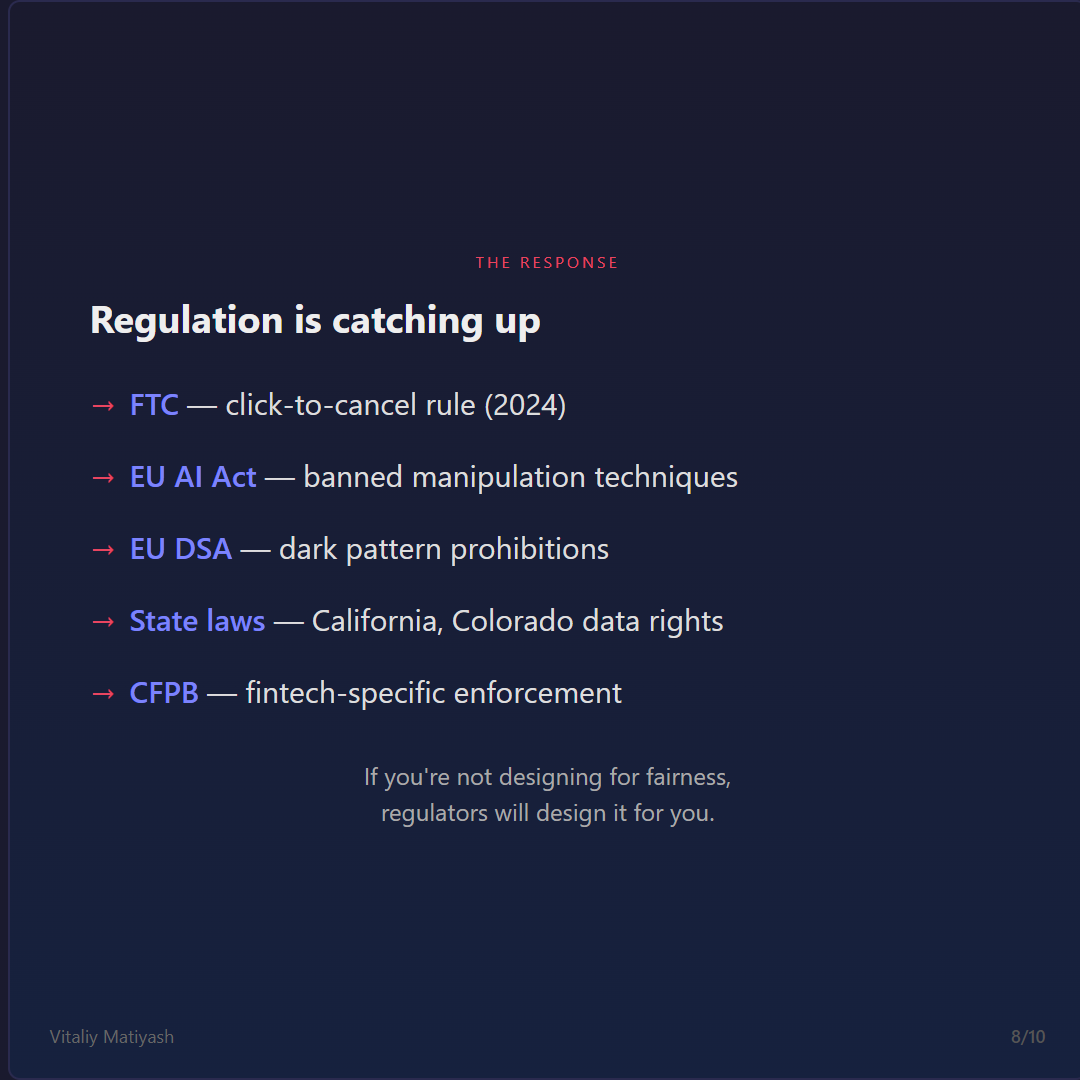
The legal landscape has changed significantly since 2022. This is no longer a theoretical compliance concern.
The 2024–2026 Legal Landscape
If you're not designing for fairness, regulators will design it for you. And their design will be less efficient than yours, more prescriptive, and applied retroactively to decisions you made two years ago.
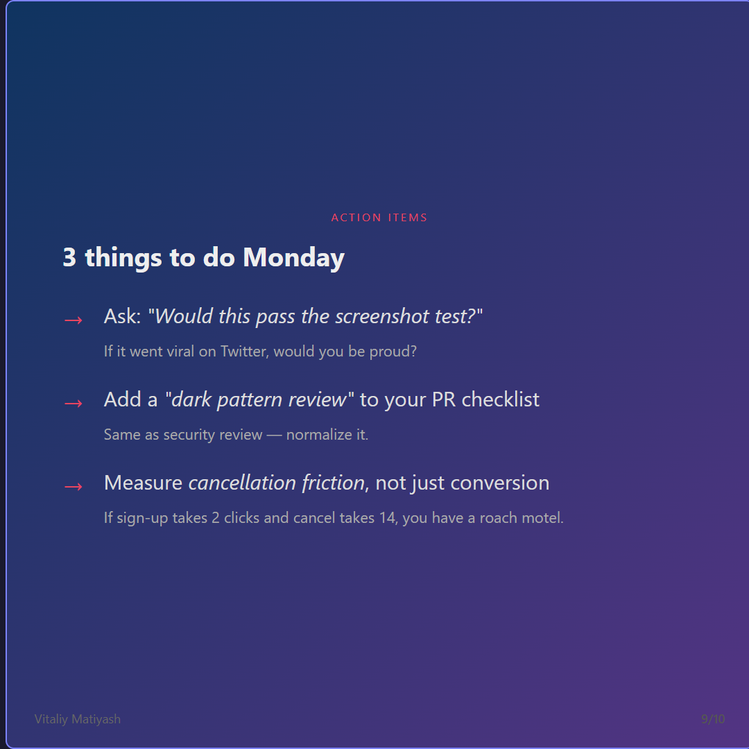
3 Things to Do Monday
The Choice Is Ours
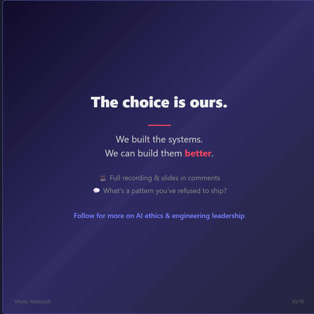
We built the systems. We can build them better.
The argument I kept coming back to in this talk: the skills we use to build deceptive systems are identical to the ones we use to build honest ones. The telemetry pipeline, the behavioral model, the conversion funnel — these are engineering artifacts. They ship what we configure them to ship. The choice of what to measure, what to optimize, what to surface in the UI — those are decisions that pass through engineering teams every day.
The A/B test that proves the gray button converts better is run by the same team that could instrument a fairness metric instead. The recommender that nudges someone toward a subscription they'll forget about uses the same architecture as one that surfaces what they actually want. The chatbot that validates every idea is trained by the same RLHF pipeline that could be tuned to push back when it matters.
None of this is easy. The economic incentives don't automatically align with the ethical ones. But the argument that "I just build what product tells me" runs out at some point. Designers didn't build the sycophantic chatbot. Engineers did. The accountability is ours too.
What's a feature you quietly refused to ship?